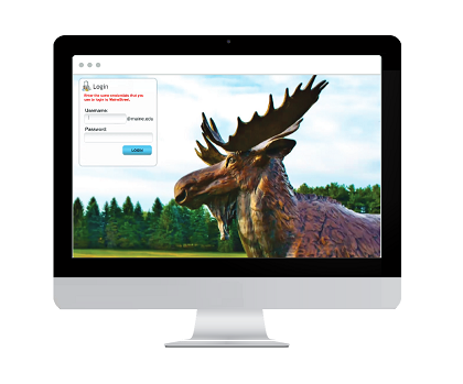
Recently, the University of Maine System went through a digital transformation for their 40,000+ students and faculty. The following post is a composition of thoughts and insights from Daniel Tyger, the Web Services Manager at UMS and principal lead on the project.
Around 2013, our portal had grown to serve more than 40,000 users, which included students, faculty and staff. At that point, we knew we wanted to modernize our intranet. It was aging from a functionality perspective and was not very usable on a variety of devices.
Since we serviced seven different and unique campuses, we needed one platform that could accommodate the wide range of users as well as offer a significantly upgraded experience for mobile. The digital transformation goal was to align with a current, active, global project with an organized codebase and release structure that allowed for innovation and exchange among project participants.
Searching for the Right Platform
For this project to be considered a success, we had to make sure we could answer the following questions:
- Could we migrate the data? Would standard upgrade steps and procedures work for our data?
- Could our themes be made responsive and usable on a wide variety of devices and browsers?
- How easily could key custom features be developed on the platform?
- To what extent could we benefit from innovation and tooling contributed by organizations around the globe?
- To what extent could we match or improve on annual costs for the project (including licenses, support and maintenance)?
- How compliant is the code with respect to WCAG, Section 508 and other universal design best practices?
We decided to reconsider our solution from the ground up. After our review of various offerings, Liferay appeared to be the best fit. We would be able to achieve many of our business needs, while at the same time keeping our costs to a reasonable level for the next few years.
Challenge of Implementation
While we found what we felt to be the right platform, it was only the start of the process. There would be a lot of challenges ahead.
For starters, data migration was a big obstacle for us. We were migrating from an old portal instance modified with JCR-stored documents and images. There was a significant chunk of time invested there, not to mention a lot of failed attempts.
CAS-SSO integration became much trickier on the clustered Liferay—a custom EhCache was utilized to resolve that. We also needed some custom user/group import processes, so we added some EXT development there. Liferay’s handling of CAS Service URLs and post-login Liferay URLs also became a challenge. To work around this, we had to write a custom web filter.
The End Result
The new platform provided several features that made launching more feasible within our limited amount of human resources and timeframe. Things like Lucene indexing, Cluster Link, EhCache EE, Advanced File System algorithm, EE Reports and Jasper Reports EE were all deployed in our implementation, and they definitely made life easier during that critical phase.
Our new site launched with nine new themes and features, including:
- Custom plugins that display class and advisee lists to faculty, including student photos and downloadable/printable lists
- Custom LDAP user import and authorization routines
- CAS SSO integration
- Primary campus site landing page configuration and management
- Responsive layout templates
- Category links, a custom portlet with 250+ role-protected, categorized applications links, including SSOs to many conscripted resources

On the end-user side of things, we've seen many reports of satisfied users. The upgraded site utilizes responsive design features, allowing students and faculty to quickly access their information regardless of location or device. What's more, our average page load time has decreased by more than 33%, and our evening usage has seen an uptick in mobile traffic.
Final Thoughts
The main thing to remember is that we're not just touting the benefits of a digital platform for its own sake. If we built this new site with all these features, and people still didn't feel that it was useful, or their experience wasn't made more personalized, then our work would've been in vain.
Fortunately, the users themselves see the benefits of the upgrade. They were looking for a modernized user experience, and we were able to give them something useful. As their needs evolve, we look forward to growing with them and expanding features on the site.